
Overview
Mizuee is a Japanese-inspired drinks brand from North Jakarta. It launched in 2023 as the second brand from the team behind Mikoho, a coffee label founded in 2019. The menu covers milk-based drinks, tea and fruit blends, coffee and a few snacks.
The brand needed a website that did two jobs. It had to make people want a drink the moment the page loaded. It also had to give prospective partners a clear way to get in touch. We designed and built the site in 2023, in Indonesian, for an Indonesian audience.
The challenge
A beverage brand website lives or dies on appetite. Mizuee sells colour and refreshment, so a plain menu page would undersell it. The site also had a goal that has nothing to do with appetite. Mizuee wanted to grow through partners, and a partner needs facts, a contact route and a reason to trust a young brand.
Three constraints shaped the work:
- The menu changes. Prices and products move more often than a website gets redeployed, so the catalogue could not be hardcoded.
- The brand had a story to tell. Mizuee grew out of Mikoho, and that history helps a young brand earn a partner's trust. It needed a home that did not bury the menu.
- Phones come first. We expected many visitors to tap through from the brand's Instagram, so the layout had to hold up on small screens.
Our approach
Discovery
We started with the two audiences and what each needs first. A customer wants to see the drinks and the price. A prospective partner wants to know who runs the brand and how to get in touch. That gave us the four-page structure: Beranda (home), Produk (products), Kemitraan (partnership) and Tentang Kami (about us), with the logo in the middle of the navigation bar.
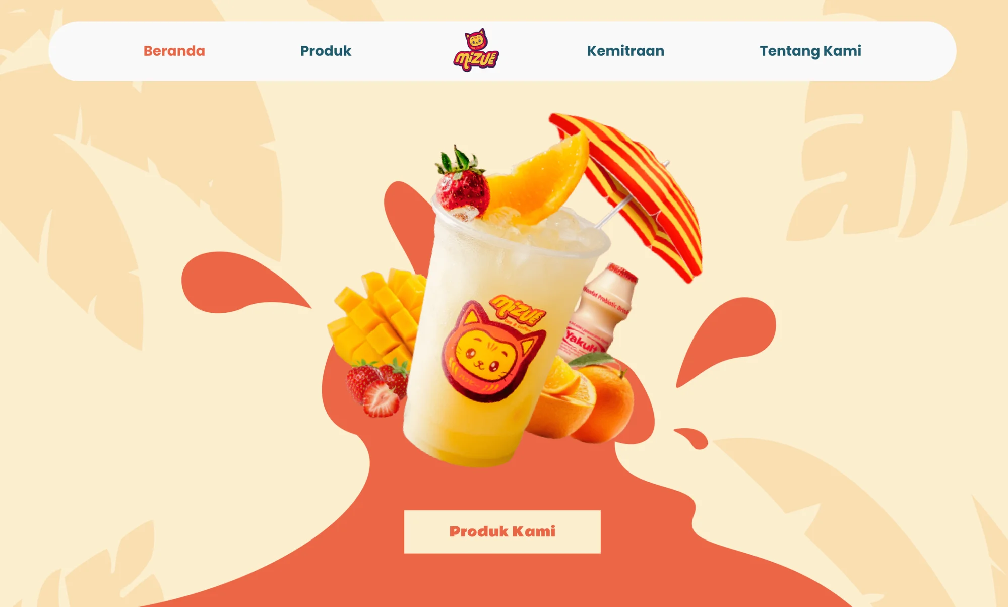
The home page does the sorting. It opens with the hero and a "Produk Kami" button, then a short brand story, a product carousel, the brand's latest Instagram posts and finally a coral banner that asks "Ingin Menjadi Partner Kami?" (Want to become our partner?). A customer can stop after the carousel. A partner keeps scrolling and lands on the invitation.
Design
We took the visual language straight from the cup. Mizuee's mascot is a cat drawn in the shape of a daruma doll, the Japanese good-luck figure, with ハッピー ("happy") written across its body. Its warm red and yellow pointed us to a coral accent. We paired it with a deep teal for text and a soft cream background, so the fruit photography carries the colour and the interface stays calm around it.
Headings use Rammetto One, a round, heavy display face that feels like a drinks label. Body copy uses Poppins.
Motion is where the site makes you thirsty. The hero artwork floats gently up and down on a loop, so the drink never sits completely still. As you scroll, each section starts slightly blurred and out of place, then slides and sharpens into focus. On the about page, the vision and mission blocks come in from opposite sides and the mascot bounces beside the brand history.
Build
We built the front end as a React single-page app with client-side routing, so moving between pages feels instant. The content that changes lives behind a small API on its own subdomain:
- Products load from the API into both the home carousel and the full catalogue, so updating a price or adding a drink updates the whole site at once.
- Brand profile content (history, vision and mission) also comes from the API, so the story can change without a new release of the site.
- Instagram posts load into the home page automatically, the six most recent, so the site looks as current as the brand's feed.
Every page has responsive breakpoints for tablets and small phones.
Key features
- Searchable product catalogue. Visitors can type a drink name or filter by category: Milk Based, Tea & Fruit Based, Coffee Based or Food. Search and category work together, prices show in rupiah with thousands separators, and a search with no match shows a friendly "product not found" message instead of a blank grid.
- Partnership enquiry form. The Kemitraan page explains what partners get, shows the brand's address in Penjaringan, North Jakarta, and asks for name, email, phone number and a message. The form checks each field before sending, including Indonesian phone formats that start with +62, 62 or 08, and shows the error under the field that needs fixing.
- Brand story page. "Telusuri Cerita Di Balik Mizuee" (Explore the story behind Mizuee) walks through the brand's history, vision and mission.
- Live Instagram feed. The home page links to the brand's account and shows its latest posts, which keeps the site fresh between menu updates.
What we learned
Mizuee showed us how much a small brand gains from separating content from code. Putting the menu and the brand story behind an API cost more setup at the start. In return, a new drink or a new price reaches the carousel and the catalogue together, with no new release of the site. For a menu that keeps changing, that is the difference between a site that stays accurate and one that drifts.
We would build the partnership flow differently today. The form validates on the page and then opens a pre-filled email to the brand's inbox. That kept the site free of any extra server work, but it depends on the visitor having an email app set up, and it gives the brand no record of enquiries in one place. Today we would send the form to a backend that stores each enquiry and notifies the brand, and show the visitor a confirmation on the page.
The other lesson was restraint in motion. Animation sells a drink brand well, and it is easy to overdo. We tied each effect to a single moment, a reveal on scroll or a loop on the hero, and that kept the site playful without feeling busy.
Start a project with us
If you run a food or drink brand in Indonesia and want a website that makes people hungry and gives partners a clear way in, we would like to hear about it. Tell us about your menu, your audience and where you want to grow, and we will show you how we would approach it.