
Overview
Arseektek is a curated gallery of Indonesian architecture. Each entry is one building, written up as a short essay with photographs, the architect, the city, the year it was completed and its style. A visitor browses by style, opens a project and reads why the building looks the way it does. Architects who want their work included can apply through a form on the site.
Kevin designed and built Arseektek as a solo project, from the first content model to the live site. At the time of writing, the library holds 18 projects by seven architects and practices, tagged across 14 styles. Andra Matin's Katamama and Potato Head Beach Club in Bali sit next to RAD+ar's Stalk Jakarta, Friedrich Silaban's Istiqlal Mosque and a timber ocean deck in Karimun Jawa.
The challenge
Indonesia has many good architects, both established names and small independent studios. Their work is hard to find in one place. Photos of a building sit on the practice's own website, on Instagram, or on international architecture publications where Indonesian projects are a thin slice of a global feed. A student looking for tropical brutalism around Jakarta has to piece it together from scattered sources.
We set two goals. The first was to present each building with the space and calm of a good printed monograph, with the photographs and the writing as the main content. The second was to let a reader move sideways, from one building to its architect or its style and on to the next building.
The harder constraint was editorial. The system had to make a good entry easy to add and a half-finished one impossible to publish.
Our approach
Discovery
We started from the content, not the screens, and turned what a reader wants to know about a building into the content model in Sanity.
A project has a title, a short description, the year it was built, up to three images, a long-form body, a city and country, style tags and a link to its architect. Title, description, slug and building year are required fields, so the editor cannot publish an entry without them.
Architects are their own records, with a name, a short bio, a city, a website and contact details. One architect record links to every building that practice designed. Andra Matin's record ties together Katamama, Potato Head Beach Club, Banyuwangi Airport and the Tubabar As Sobur Mosque in Lampung.
Styles are tags rather than a fixed category, because real buildings rarely fit one box. Aruma Split Garden by RAD+ar is tagged both Tropical and Brutalist.
Design
The design takes its rules from the buildings it presents. Photographs get most of the screen. Type is large and plain, and the controls stay small. A toggle in the header switches between a light and a dark theme.
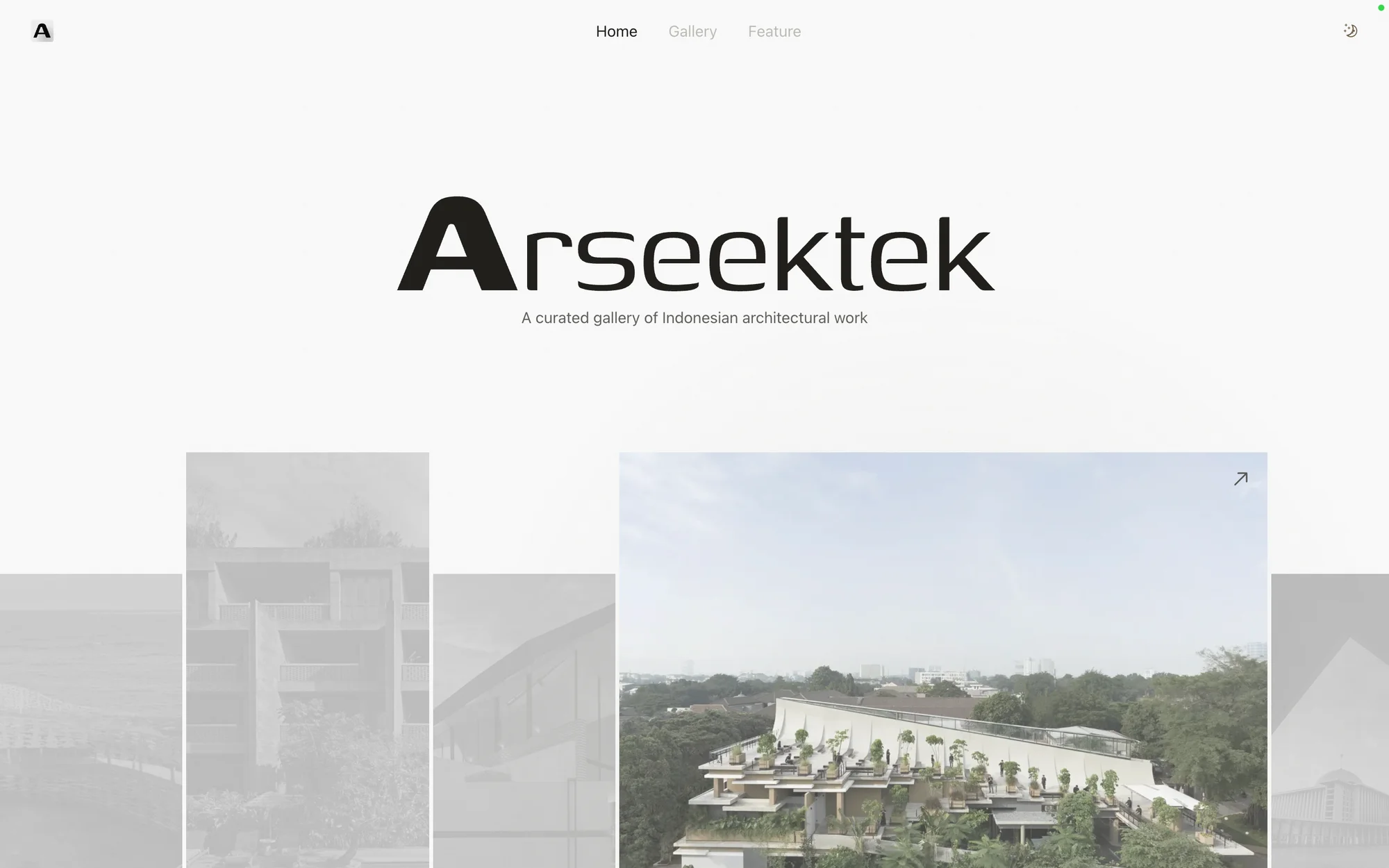
The home page opens on the Arseektek wordmark over a grayscale collage of featured buildings. Below it, two columns split the reader's choices. On the left, style chips for Sustainable, Brutalist, Minimalist, Tropical and Industrial filter a feed of projects. On the right, a list of newly featured projects shows each title, its tags, a short excerpt and the architect.
The gallery gives each project its own row and alternates image and text from side to side. Every card shows the title, a two-line excerpt, the architect and the city, so a reader can decide whether to open it without guessing.
Project pages lead with the building's name and its photographs, then the essay, broken up with its own subheadings. The writing is what sets Arseektek apart from a photo feed. The As Sobur Mosque piece explains that the tower rises 30 meters for the 30 juz of the Qur'an and that its 99 light openings stand for the 99 names of Allah.
The footer carries Mies van der Rohe's line "Less is more", which sums up the rule the whole interface follows.
Build
The front end is built with Next.js and reads its content from Sanity, a headless CMS. Kevin set up a Sanity Studio for editing, with four document types: projects, architects, style tags and submissions. Publishing a building in the Studio puts it on the site without a code change.
Style filters live in the address, as in /gallery?category=tropical. A filtered view is a link someone can share, and the footer's Minimalist, Modern and Tropical links go straight to those views.
Each project page sets its own page title and meta description from the entry's description field. That gives every building a search result of its own. The site also ships Open Graph and Twitter card images for clean link previews, and a web app manifest so a visitor can save Arseektek to their phone's home screen and open it full screen.
The "Be featured" form asks for the project name, a short and a longer description and a public image link from Google Drive or OneDrive, then the contact details on the next step. Submissions arrive in the Studio as their own document type, separate from published projects. An editor reviews each one and writes the entry before anything goes live.
Key features
- Style chips and shareable filtered gallery links
- Project pages with an essay, photographs, architect, city and year
- Architect records linked to all of their buildings
- A "Be featured" form that queues submissions for review
- Light and dark themes
- Per-project titles, meta descriptions and link previews
What we learned
The content model is the product. Most of the decisions that shape how Arseektek feels were made in the schema. Required fields keep entries complete. Separate architect records make the sideways browsing possible. Tags let a building sit in more than one style.
Curation does not scale by itself. A submission queue brings in leads, but each entry still needs research, good photographs and an essay worth reading, so the editor keeps the final say.
There is more to do. The home page and gallery load their projects in the browser, so they show a loading state before the work appears. Rendering them on the server would show the work sooner and make them easier for search engines to read. Architect profile pages are the next obvious addition, since the content model already supports them.
Start a project with us
If you run a practice, a gallery or a publication and want a website built around your projects, we would like to hear about it. We design the content model, the interface and the build together, so the site stays easy to run after launch.